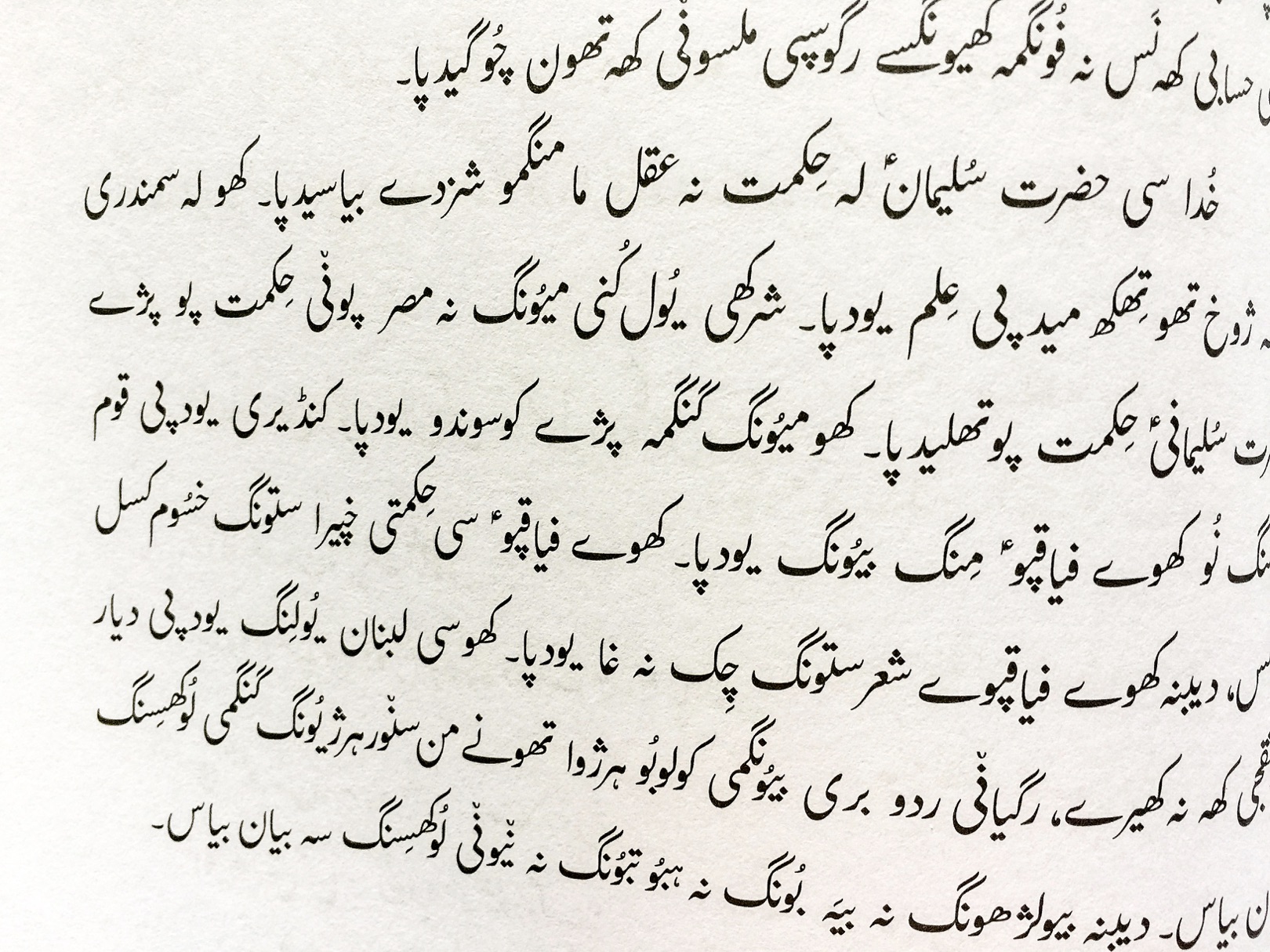
 Printed text in the Balti language of South Asia from The Lives of the Prophets book using the Awami Nastaliq font. The Lives of the Prophets comprises the life of Joshua, Gideon, Ruth, David, Solomon, Ahijah, Elijah, Elisha, Jonah, Isaiah, Jeremiah, Daniel, Haggai and Zechariah, and prophecies about the Messiah, and is used as a way to introduce people from a non-Christian background to the Bible.
Awami Nastaliq is an Arabic-script font specifically intended for a wide variety of languages of Southwest Asia. Awami is an Urdu word meaning ‘of the people’. While Nastaliq is the name given to the sloping style of Arabic writing which is based on a centuries-old calligraphic tradition. And, because of its beauty, has sometimes been called the ‘bride of calligraphy.’
Your eye adapts to it
Its sloping beauty (see right) means it is a much more complex font to render on computers than the flat Naskh-style Arabic font. Peter Martin, who is based in Scotland, was the type designer for Awami Nastaliq. He was working alongside programmer colleagues Sharon Correll (USA) and Martin Hosken (Asia) to produce the correct shaping for the slope of the font. But all the while avoiding any overlapping of dots and diacritics – no small task.
‘When people start typing the first letter it starts on the base line. But then when the second letter is typed, the first one gets pushed up in the air so the second character is on the base line,’ Peter explains. ‘And that dancing effect continues as the word gets longer. It is bamboozling the first time you see it. But as you work on it, your eye adapts to it and you realise the beauty of it.’